Extend the previous example to include the 10th to 90th precentile range of the monthly climatology, to produce a figure like:
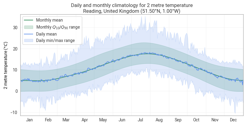
Refer to the Climatology calculations tutorial for some hints on how to do this.
from earthkit import data as ekd
from earthkit import plots as ekp
from earthkit import transforms as ekt
from earthkit.transforms._tools import earthkit_remote_test_data_file
Get some demonstration ERA5 data, this could be any url or path to an ERA5 grib or netCDF file.
remote_era5_file = earthkit_remote_test_data_file("ERA5-Reading-2m-temperature-1940-2025.nc")
era5_xr = ekd.from_source("url", remote_era5_file).to_xarray()
era5_xr
Calculate the monthly and daily climatologies
climatology_monthly_mean = ekt.climatology.monthly_mean(era5_xr, climatology_range=("1991", "2020"))
climatology_daily_mean = ekt.climatology.daily_mean(era5_xr, climatology_range=("1991", "2020"))
climatology_daily_min = ekt.climatology.daily_min(era5_xr, climatology_range=("1991", "2020"))
climatology_daily_max = ekt.climatology.daily_max(era5_xr, climatology_range=("1991", "2020"))
climatology_daily_mean
Monthly quantiles
In the cell below calculate the monthly climatologies for the 0.1, 0.5 (median) and 0.9 quantiles.
climatology_monthly_quantiles = None
climatology_monthly_quantiles
Plot the output
First we plot the climatology data using an earthkit-plots Climatology figure.
chart = ekp.Climatology(wrap_time=True)

chart.fix_y_units("celsius")

# Monthly median + q10/q90 envelope
chart.line(climatology_monthly_quantiles.sel(quantile=0.5), label="Monthly median", color="seagreen", drawstyle="spline")
chart.fill_between(
    climatology_monthly_quantiles.sel(quantile=0.1),
    climatology_monthly_quantiles.sel(quantile=0.9),
    label="Monthly $Q_{10} / Q_{90}$ range",
    color="seagreen",
    drawstyle="spline",
)

# Daily mean + min/max envelope
chart.line(
    climatology_daily_mean,
    label="Daily mean",
    color="cornflowerblue",
)
chart.fill_between(
    climatology_daily_min,
    climatology_daily_max,
    label="Daily min/max range",
    color="cornflowerblue",
)

chart.title(
    "Daily and monthly climatology for {variable_name}\n{location:%c}, {location:%C} ({latitude:%Lt}, {longitude:%Ln})"
)
chart.xticks(frequency="M", period=True)
chart.ylabel()
chart.legend()
chart.show()