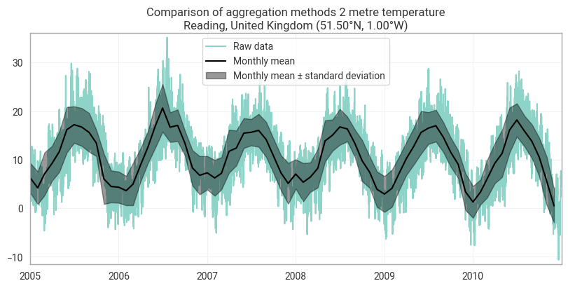
Complete the notebook to produce a plot of monthly mean with +/- standard deviation spread.
Import pacakges and load some sample data.
from earthkit import data as ekd
from earthkit import plots as ekp
from earthkit import transforms as ekt

era5_reading_1940_2025_point_data = ekd.from_source("url", "https://sites.ecmwf.int/repository/earthkit-data/test-data/ERA5-Reading-2m-temperature-1940-2025.nc")
era5_reading_1940_2025_point_data
Loading...
Compute the mean and standard deviation of the data, see the Calculate Monthly Means How-to guide
monthly_mean = ekt.temporal.monthly_mean(era5_reading_1940_2025_point_data)
monthly_std = ekt.temporal.monthly_std(era5_reading_1940_2025_point_data)
Plot the data with earhtkit plots.
time_window = slice("2005", "2010")
chart = ekp.TimeSeries()

# Plot the raw data and various aggregations on the same chart for comparison:
# Raw data:
chart.line(
    era5_reading_1940_2025_point_data.to_xarray().sel(valid_time=time_window),
    units="celsius", label="Raw data"
)

# Add the monthly mean as a black solid line and spread as black dotted lines:
chart.line(
    monthly_mean.sel(valid_time=time_window),
    units="celsius", label="Monthly mean", color="black"
)
upper_m = monthly_mean + monthly_std
lower_m = monthly_mean - monthly_std
chart.envelope(
    upper_m.sel(valid_time=time_window),
    lower_m.sel(valid_time=time_window),
    units="celsius",
    label="Monthly mean ± standard deviation",
    color="black",
)

chart.title(
    "Comparison of aggregation methods {variable_name}\n{location:%c}, {location:%C} ({latitude:%Lt}, {longitude:%Ln})"
)
chart.legend()
chart.show()