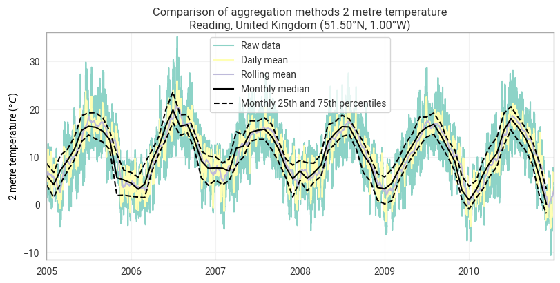
The earthkit.transforms.temporal module provides a high-level API for computing daily and monthly statistics from time series data. Instead of manually grouping by day or month and applying reductions, you can call convenience functions such as daily_mean, daily_max, daily_min, daily_std, daily_sum, and their monthly equivalents (monthly_mean, monthly_max, etc.).
These functions automatically detect the time dimension in your data and handle the grouping for you. They accept any data format understood by earthkit.data (e.g. GRIB, NetCDF) as well as xarray.Dataset and xarray.DataArray objects directly.
from earthkit import data as ekd
from earthkit import plots as ekp
from earthkit import transforms as ekt
Load some test data
Load some sample point data from a remote netcdf file.
# Get some demonstration ERA5 data, this could be any url or path to an ERA5 grib or netCDF file.
era5_reading_1940_2025_point_data = ekd.from_source("url", "https://sites.ecmwf.int/repository/earthkit-data/test-data/ERA5-Reading-2m-temperature-1940-2025.nc")
era5_reading_1940_2025_point_data.to_xarray()Calculate the daily statistics
Below we demonstrate the flexibility of the transforms functions by passing in
the raw file object, an xarray.Dataset and a pandas.DataFrame.
The functions can handle all types.
era5_reading_xr = era5_reading_1940_2025_point_data.to_xarray()
era5_reading_pd = era5_reading_xr.to_dataframe()

# Compute with file object input
era5_daily_mean = ekt.temporal.daily_mean(era5_reading_1940_2025_point_data)

# Compute with xarray input
era5_daily_max = ekt.temporal.daily_max(era5_reading_xr)

# Compute with pandas input
era5_daily_min = ekt.temporal.daily_min(era5_reading_pd)
# Pandas does not preserve attributes, so we manually set the units for plotting purposes
era5_daily_min.t2m.attrs.update({"units": "kelvin"})

era5_daily_meanCalculate the monthly statistics
There are similar functions for monthly aggregations, and for both daily and monthly there are
generic daily_reduce and monthly_reduce functions which take a how argument, as
demonstrated in the previous notebook.
The code cell below uses the monthly_reduce method to compute the 25th and 75th percentiles, which does not (yet) have a direct method.
monthly_median = ekt.temporal.monthly_median(era5_reading_1940_2025_point_data)
monthly_q25 = ekt.temporal.monthly_reduce(era5_reading_1940_2025_point_data, how='quantile', q=0.25)
monthly_q75 = ekt.temporal.monthly_reduce(era5_reading_1940_2025_point_data, how='quantile', q=0.75)
monthly_q25Rolling reductions
It is also possible to calculate rolling reductions with a simplified API. Pease note that improved API to the rolling_reduce method is an ongoing task, feedback welcome on this.
era5_rolling = ekt.temporal.rolling_reduce(
    era5_reading_xr,
    24*30,
    how_reduce="mean",
    center=True,
)
era5_rollingPlot a time-series for the various statistics calculated
time_window = slice("2005", "2010")
chart = ekp.TimeSeries()

# Plot the raw data and various aggregations on the same chart for comparison:
# Raw data:
chart.line(era5_reading_xr.sel(valid_time=time_window), units="celsius", label="Raw data")
# Daily mean:
chart.line(era5_daily_mean.sel(valid_time=time_window), units="celsius", label="Daily mean")
# Rolling mean:
chart.line(era5_rolling.sel(valid_time=time_window), units="celsius", label="Rolling mean")

# Add the monthly median as a black solid line and spread as black dotted lines:
chart.line(monthly_median.sel(valid_time=time_window), units="celsius", label="Monthly median", color="black")
upper_m = monthly_q75
lower_m = monthly_q25
chart.line(
    upper_m.sel(valid_time=time_window),
    units="celsius",
    label="Monthly 25th and 75th percentiles",
    linestyle="--",
    color="black",
)
chart.line(lower_m.sel(valid_time=time_window), units="celsius", linestyle="--", color="black")

chart.title(
    "Comparison of aggregation methods {variable_name}\n{location:%c}, {location:%C} ({latitude:%Lt}, {longitude:%Ln})"
)

chart.ylabel()

chart.legend()

chart.show()